

Eyes on the Prize
Announcing the winners of the 2014 MJSA Vision Awards
Some started with an amazing gem—a glowing moonstone, an exquisitely carved spessartite garnet. Many relied on lasers and CAD/CAM to be fully realized, while still exhibiting the spirit of Old World craftsmanship. And one is a prime example of how beautiful jewelry is being marketed in the 21st century.
They are the winning entries in the 2014 MJSA Vision Awards competition, and all are to be admired.
Since 1990, the Vision Awards have recognized the best in jewelry making and design, showcasing the work of professionals and students alike, and that tradition still holds true today. But, like any vital tradition, it has evolved over the years, and 2014 saw the introduction of two new Distinction categories—CAD/CAM and Digital Marketing—to demonstrate how new technologies are advancing the design, making, and selling of jewelry. In addition, this year the competition divided the Professional Excellence category into two sections, to recognize those designers just starting out (i.e., in business for three years or fewer) and who represent the future of jewelry design.
On the following pages, you’ll find the stories behind the winners. (For the Custom Design Distinction honoree, click here.) First, though, a few thank yous are in order, beginning with those for the MJSA Vision Award sponsors. Without them there would be no competition, and we urge you to show your support by learning more about their products and services. MJSA would like to thank Rio Grande (General Sponsor), LaserStar Technologies (Laser Distinction Sponsor), EnvisionTEC (CAD/CAM Distinction Sponsor), TechForm Advanced Casting (Custom Design Distinction Sponsor), MJSA Education Foundation (Future of the Industry Sponsor), Instore (Media Sponsor), and Metalsmith (Media Sponsor).
We’d also like to thank the judges for this year’s competition: Eugene Brill of Jewelry.com; Michael Coan of the Fashion Institute of Technology; Jason Dow of Jason Dow Jewelry; Cindy Edelstein of the Jeweler’s Resource Bureau; Lee Krombholz of Krombholz Jewelers/Just Like You Designs; Eva Martin of Eva Martin Jewelry; and Joel McFadden of Joel McFadden Designs. To paraphrase an old adage, it takes superior talent to recognize superior talent, and we’re lucky to have such an amazing and talented group of judges.
Now, without further ado, we invite you to enjoy the winners of this year’s Vision Awards…
Out of the Blue
By Shawna Kulpa
Leon Megé
Leon Megé Inc., New York City
First Place, Professional (4 Years)
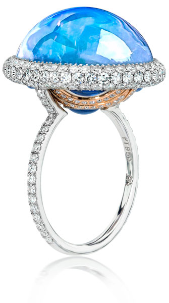
Sometimes when a designer sets out to create a piece of jewelry, he has a plan laid out in his mind, knowing each and every step he’ll take in its creation. And sometimes, he doesn’t. Sometimes he has a gorgeous stone that needs to be showcased and he just dives right in without a game plan. That was the case with Leon Megé of Leon Megé Inc. in New York City.
From the moment he acquired it, the color of the 14.65-carat moonstone captivated Megé. “It is a true blue moonstone,” he says. “There is no trace of any red or yellow in the color, which is rare.” In order to best showcase the stone, he wanted to create a design that would emphasize the stone’s color. Beyond that, Megé didn’t have a plan. “I had a beautiful blue moonstone, and no idea what to do with it.”
The first thing he decided was to surround the stone with micro-pavé, using single-cut diamonds to help highlight the color of the moonstone. “I used single-cut diamonds because they are whiter and brighter,” he says. “Full-cut diamonds would create a rainbow of colors, and I wanted the background to be almost pure white.”
To help maintain that white look, Megé fabricated the ring’s barrel-shaped halo and shank in platinum. He also cut a palladium cup that would sit under the stone inside the halo. “When palladium is gently heated, it turns slightly blue,” he explains, which would help to highlight the color of the moonstone. In addition, the cup allows light to be reflected from underneath the stone and doesn’t allow the wearer’s finger to be visible through the stone. “I wanted to prevent skin tones from affecting the color of the stone,” he says.
Megé soldered the palladium cup to the halo but then, as often happens in his design process, he had another inspiration: He decided to add blue sapphires to the back of the cup, further magnifying the moonstone’s color. He removed the cup from the halo and cut windows out of it for the stones. He then had sapphires hand cut to fit the windows.
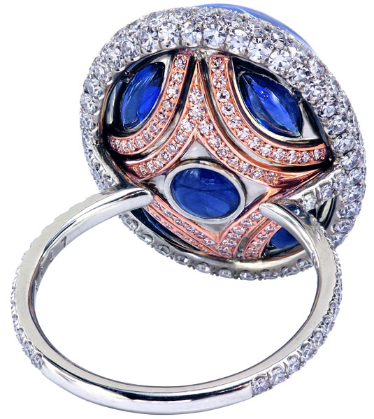
Before he reattached the cup, Megé decided to add another touch to the back. He wanted to create a sense of ocean waves riding in, with the pavé-set diamonds as the foam at their crest. He wanted the waves to be distinct, so he considered making them a different colored metal.
“Yellow gold was too strong [a contrast],” he says. “I wanted something that would complement the blue.” Eventually he settled on 18k rose gold. He created the “waves” from curved strips of gold, laser welded them to the back of the palladium cup, and then set them with diamonds.
With the back of the cup complete, Megé created bead settings for the sapphires inside the cup, so they would not be visible from the outside. “If I had planned this from the beginning, I would have set them from the front,” he explains. “It wasn’t a bad decision as they look nicer [set from the inside], but it makes the ring less serviceable.”
He soldered the shank to the rose gold section, pavé-set the diamonds on the shank, and laser-welded the palladium cup to the halo. He then set the three rows of diamonds on the halo, and used the beads from the top row of micro-pavé to secure the moonstone in place.
While the lack of planning and forethought might make some designers break out in hives, it works for Megé. And clearly, with his first-place win in the Vision Awards, it can lead to beautiful creations. “It’s my favorite ring,” he says. “I didn’t think twice about it. It was just obvious.”
Floating Free
By Shawna Kulpa
Evan deJonghe
Evan Maxwell Design, Saratoga Springs, New York
First Place, Professional (1-3 Years)
Up-and-coming designer Evan deJonghe isn’t short on jewelry influences in his life: He is the son of award-winning jewelry designer Dennis deJonghe, of deJonghe Original Jewelry in Saratoga Springs, New York. Growing up around gold and gemstones obviously influenced Evan, who started his own brand, Evan Maxwell Design, in 2014.
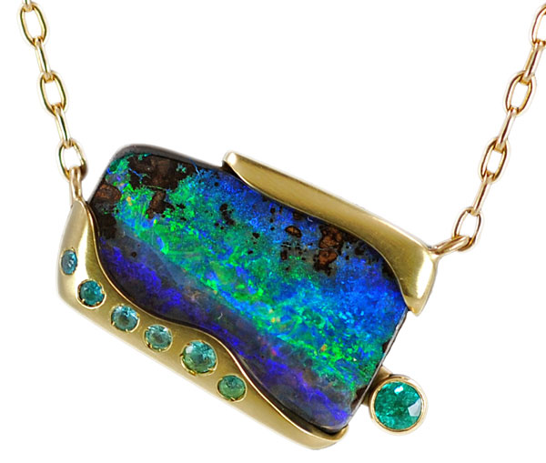
While perusing his family’s collection of gemstones one day, deJonghe came across a 17.35-carat boulder opal. “The opal stood out because of the awesome patterns of colors within the stone—the way the colors work and the shape of the overall stone were the driving forces in the design,” he says. He decided to create a statement piece that would showcase his skills, and show “who I am as a designer,” he says.
DeJonghe sat down to sketch with a few ideas in mind. First, he wanted the piece to be “a little different”: to hang in a nontraditional way and be “crooked on purpose,” as deJonghe describes. Next, he knew he wanted to feature 18k yellow gold in the piece. “I think 18k gold looks great with almost any opal because it complements the colors very well,” he explains.
Additionally, he wanted to add gems that would play off the blue-green colors of the opal. Wanting to make the “colors of the opal flow out of the stone like a waterfall right into the other gems,” he immediately thought of Paraiba tourmalines for their complementary color.
Next, he decided that creating two separate gold pieces—a top and bottom connected with setting bars behind the opal—would create the effect of the opal floating between the yellow gold. It would also allow him to attach a round, bezel-set 3 mm Paraiba tourmaline beside the opal, so it appeared to be floating as well.
With his design in mind, it was time to sit down at the bench. DeJonghe chose to hand-carve wax for the top and bottom gold pieces because he felt it would allow for better precision and a “perfect fit” around the opal. His artistic mission is to combine old techniques with new technologies, and while he agrees that certain pieces require CAD, he wanted to keep this piece hand-carved. “I’m lucky enough to have grown up with a renowned jewelry designer as my father, who only hand-carves waxes,” he explains. “It’s important to me to maintain what is becoming a lost art.”
He started by melting wax onto the opal in the exact place he envisioned the 18k gold pieces to be. He then built up the wax and began to refine the lines, carving the shape of the wax.
Using sterling silver stock as a model for the setting bars, he then practiced connecting the two wax sections with the setting bars. “It was challenging because I had to be exact with my placement [of the sections] and take into account the shrinkage factor after casting the top and bottom sections in 18k gold,” he says.
Once the carvings were complete, he removed the separate wax pieces from the opal and sent them to be cast. After he received the castings, he used a bur to manually clean up the insides so the opal would fit perfectly. He then flush-set six Paraiba tourmalines in the bottom gold section.
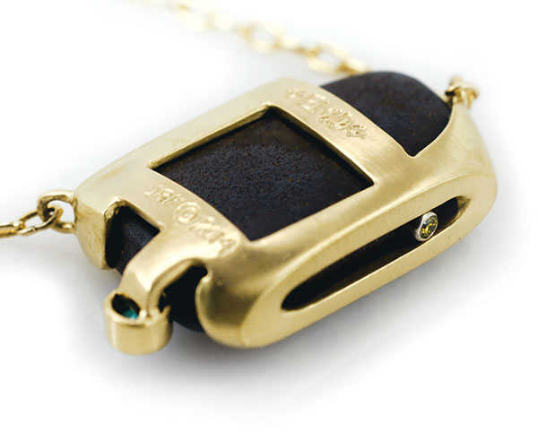
Next, he made sure the setting bars, which he fabricated from 18k yellow gold stock, would connect exactly as he had modeled with the silver. Using a laser, he first welded both bars to the top section before welding the bezel-set tourmaline to one of the bars. “At this step, the setting bars were essential because without them, there would have been no place to attach the Paraiba tourmaline to maintain the floating effect of the piece,” says deJonghe.
The design also features a hidden, bezel-set yellow diamond on the underside of the bottom gold section. The yellow diamond, which was not in his original design, again speaks to deJonghe’s ability to embrace his influences. While creating the wax mold, he decided to hollow out the bottom to save on weight. “My father said, ‘Why don’t you put a diamond in there?’” deJonghe says. “That’s his contribution to the piece. It’s special to me because although it is my pendant and my design, he plays such a large role in my life.”
After all the smaller gems were placed, deJonghe set the opal by welding the setting bars to the bottom gold section. He then applied a satin finish “to make the opal and gems stand out more and to add more warmth to the gold,” he explains. He attached a split gold chain as the finishing touch.
The challenge of practicing these techniques, from the hand-carved waxes and the setting bars to the use of laser technology, informs this designer’s future designs as he expands his repertoire and uncovers his own stylistic choices. “I’m working to establish my own style as I’m discovering my abilities, talents, and design as an artist,” he explains. “But this piece will definitely play a role in achieving that. With this piece, I can say, ‘Yes, this was successful. Now, how can I take this piece and continue my success?’”
Best Laid Plans
By Shawna Kulpa
Ryan Roberts
Ryan Roberts Ltd., Chimayo, New Mexico
First Place, Laser Distinction
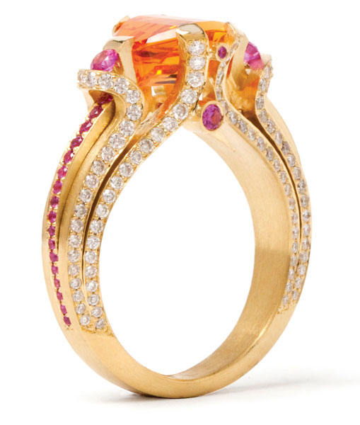
He just couldn’t help himself. When Ryan Roberts sat down to create a piece to showcase a 3.46 spessartite garnet cut by Stephen Avery, he started with the idea of making something a bit more understated and less expensive than his usual creations. “This ring really did start out with me making an effort to hold back,” says Roberts. But, like the best laid plans of mice and men, it quickly went awry.
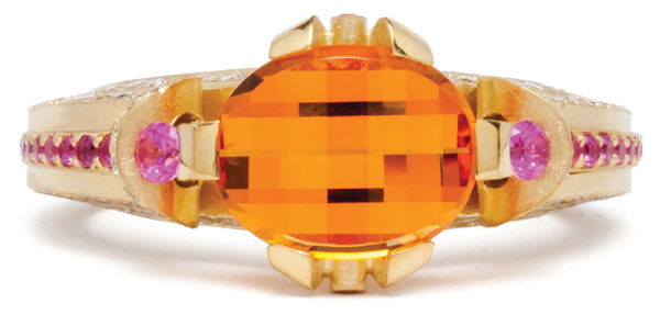
Because he admits to being “center-stone oriented,” Roberts approached the project looking for a way to best showcase the unique garnet. “The stone has an unusual cut. It has a curved girdle and a curved surface with no table,” he says. “I wanted to create a design that moved off of the curved side section [of the stone]. I wanted the curve of the prongs to follow the curve of the stone down.”
To begin the project, Roberts turned to CAD. “As a fabricator, I don’t plan,” he admits. “With CAD, I can fiddle around, solidifying ideas without wasting any metal.”
Once he was satisfied with the design, he cast the 18k gold ring in four pieces: an interior band, an exterior band that merges with the interior band, and two rails that would be placed on the sides of the ring. He likes to cast the pieces separately because it allows him the chance to clean everything up prior to assembly, after which cleanup becomes difficult, if not impossible.
To join the interior and exterior bands, Roberts used a laser welder to tack them together. “One of the great things about the laser is that you can easily tack things, check the position of the parts, and if it’s not quite right, break them apart and try again,” he says. “It’s a lot of trial and error, but that’s what makes the laser great.”
When he was happy with the position of the two bands, Roberts soldered them together. “The bands are pretty thick and I needed a strong weld,” he explains. “It wouldn’t be cost- or time-effective to weld the entire band with a laser.” Plus, “the laser leaves little circles when it welds, whereas solder leaves a neat, clean line,” making cleanup easier.
After soldering the bands together, Roberts used an engraver to clear out a small amount of solder from the solder line. He then used the laser to weld matching 18k material over the solder joint. “Because solder is always slightly off-color, I wanted to create a flawless line on the surface of the ring,” he says. “It’s an unnecessary detail, but one I like to do anyway.” Once the welding was complete, he pavé-set the 0.92 ctw of diamonds that run along the sides of the bands.
The design also called for a row of pavé-set sapphires to run along the outside of each side rail, and for those rails to run underneath the looped tops of the outer bands. That meant he had to pavé-set all those sapphires prior to attaching the rails to the ring. “For this piece, the laser welder was critical because it allowed me to do all of the stone setting before assembly,” he says. “I wouldn’t be able to set the stones once everything was in place.” While sapphires can tolerate the heat from a torch, Roberts didn’t want to risk breakage or any kind of color change.
Once the sapphires were set, he tucked the rails against the sides of the ring and under the top loops of the outer band. He then used the laser to weld the rails in place, securing them at the top and bottom to the outer band. He added four tube-settings, two on either side, connecting the sides of the inner band at the top of the ring. He used his laser to tack them in place, allowing him to situate the settings perfectly without committing to a location. Once satisfied with their positions, he soldered them in place and set them with sapphires. With the ring crafted, Roberts completed the piece by setting the garnet and two side sapphires into the tops of the bands and rails.
Now with an award-winning ring, Roberts admits that the design would not have been possible without a laser welder. “The laser welder has completely changed the way I think about constructing my pieces,” he says. It’s made things that were once impossible (or at the very least, extremely difficult), possible, including this ring. And while it’s not quite the less-grandiose piece Roberts originally set out to design, he does feel that he managed to show a bit of restraint. “I stopped myself from having stones going all the way around the band so it can be sized,” he says. One step at a time.
Photos by Robert Railey.
Rolling Forward
By Shawna Kulpa
Robin Waynee
Ryan Roberts Ltd., Chimayo, New Mexico
First Place, CAD/CAM Distinction
Second Place, Professional (4 Years)
One of the reasons many jewelry designers like to use a pencil to sketch their designs is because the utensil allows them to go back and easily make changes to their work. The same can be said for jewelry designers who’ve embraced computer-aided design (CAD). “CAD is amazing,” says Robin Waynee of Ryan Roberts Ltd. in Chimayo, New Mexico. “You can create a piece of jewelry, play with metal, stone settings, all at your fingertips.” It can even take you places you never imagined.
That was certainly the case with Waynee. In 2009 she fabricated a rolling pearl bracelet featuring links that housed Tahitian pearls that were pinned so they rolled freely as the bracelet was worn. (The bracelet later won first place in the silver/Argentium category of Rio Grande’s annual Saul Bell Design Award competition.) “I wanted to revisit the rolling concept,” she explains. “I started designing another bracelet, initially drawing it out on paper before I took it to CAD because I had so many design ideas.”
As she played with the design in CAD, it began to evolve. “I had it together and I was playing with metal choices,” she says. “Somewhere along the way I wound up being inspired to make a pendant with the bracelet design. I looked at the initial link design I had created for the bracelet and realized that it could be more than a bracelet.”
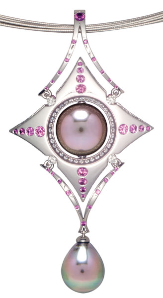
But, since the original link was designed to be part of a bracelet, Waynee had to make some modifications along the way. “Initially the link was sized for a bracelet, but I wanted the pendant to have presence, so I went up to a 12.1 mm–sized pearl, adjusting the metal around it to accommodate the larger pearl.”
In addition to allowing Waynee to easily alter her design, CAD enabled her to overcome several technical challenges.
Since the pearl is meant to roll, Waynee needed to make sure the metal surrounding it was precise. “Because the pearl spins freely within the surround, clearance is critical,” she explains. “CAD allowed me to precisely create the pearl surround.”
It also enabled her to create holes in the surround for the pin that would secure the pearl in place. “It’s hard to drill this type of hole in reality,” she says. “Using CAD allowed me to virtually drill the holes and have them perfectly centered.”
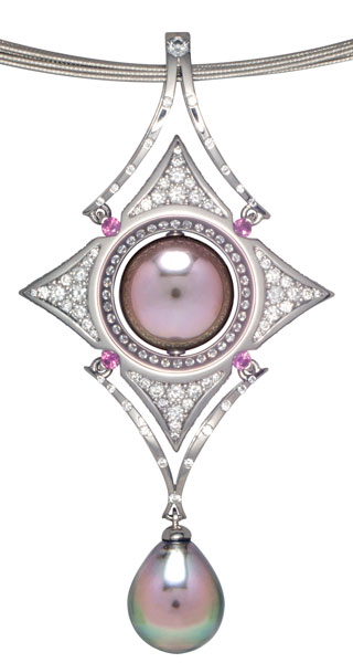
CAD was also critical in enabling Waynee to make the piece reversible: It allowed her to easily duplicate the main body of the centerpiece, and then alter the two sides to make each one unique. “The program lets you build locator tabs into the piece that make it easy to line everything up precisely during assembly,” she says.
In addition, CAD saved her a great deal of time. Her initial sketch for the pendant was very basic. Working with the digital sketch allowed her to play with different variations for the diamonds and sapphires that adorn the two sides of the pendant, making the precision layout for the pavé and flush-set stones quick and easy. Once she was satisfied with the layout, Waynee had the 1.5 mm–thick mirrored pieces cast in palladium.
But CAD wasn’t necessary for every part of the pendant. “I sketched out by hand the upper and lower v-shaped pieces for the top and bottom of the pendant,” says Waynee. “The design was so straightforward, it was easy to quickly fabricate those pieces by hand.”
Although this project had her wielding both a pencil and her computer mouse, Waynee ultimately credits the pendant’s creation to CAD. “It resolves any design issues,” she says. “You can try something this way, try it that way, all with the click of a button, and without wasting any metal. It’s pretty awesome,” she concludes, a sentiment she would feel confident making in permanent marker.
To read more about how Waynee assembled her reversible pearl pendant, see “Mirror, Mirror” in the March 2014 issue of MJSA Journal.
Photos by Robert Railey.
’Round and ’Round
By Rebecca Oster Bach
Jinbee Park
Fashion Institute of Technology, New York City
First Place, Future of the Industry
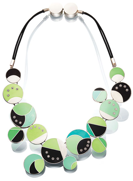
When jewelry designer Jinbee Park created her Cacophony of Harmony necklace, she was enrolled in a class on alternative materials at New York City’s Fashion Institute of Technology. Inspired by the class, Park knew she wanted to incorporate alternative materials into the necklace, and was particularly drawn to resin for its versatility and the challenges it presented. “I chose resin because I wasn’t familiar with it, and it allowed me to play with colors and pour it to form any shape I wanted,” she says.
She began by sketching various sized circles grouped together in an asymmetrical design. “My goal was to make the necklace balanced, but still very free: different sizes not matching exactly, but all related,” she says. Once she had an initial design, Park cut strips of sterling silver in varying lengths, formed them into circles, then segmented each circle with additional strips that she soldered into place. When she had a variety of sizes, she laid out the circles along a mantel to better visualize the grouping she wanted.
After playing with the arrangement, she soldered groups of two or three circles together. Because she wanted to give the necklace movement and make it comfortable to wear, she cut small pieces of silver wire to use to connect the groupings together. To join them, she drilled two holes inside the circles that would connect each grouping. She then fit the U-shaped wire through both holes of one circle before running the ends of it through the holes of another circle and soldering the wire in place, adjoining the circles.
With the base of the necklace complete, Park began experimenting with the resin. Inspired by the colors, contrasts, and similarities found in nature, she wanted to use black, white, and sky blue hues to indicate day and night alongside natural green tones. She used quick-drying black and white resins to begin, then mixed the white resin with neon greens and blues, even adding purple tints to the blues to create a more vivid color.
Because the circles did not have backs, Park placed clear, Scotch tape across the bottom of the circles to act as a floor that would hold the resin in place while it cured. Once the resin cures, it fuses to the silver. “Unless you dissolve the resin, the bond is permanent,” says Park. She also wanted to add cubic zirconia to several of the circles so she placed silver tubing on the tape, planning to set the stones once the poured resin cured.
For Park, one of the challenges of this design was the trial-and-error nature of working with a new material. The first time she mixed the resin, she didn’t use enough tint and the color cured a much softer hue that she anticipated, requiring her to melt the resin out of the circles and start over again. But as she went along, Park learned to welcome the various and sometimes unexpected shades the process brought to her piece. “It’s hard to control the exact colors every single time, but it worked out well with my piece because the point was to play with different colors,” she says.
Throughout this project, Park em-braced the process of learning about her materials. For example, to combat the bubbles that formed in the resin, she held a blow dryer on high about 6 inches away from the surface, directing the air onto the resin so that the heat could draw the bubbles to the surface. She could then pop the bubbles by hand with a toothpick, ensuring a smooth surface for her necklace. Additionally, once the resin cured, the shiny surface was not the matte finish Park had originally envisioned, so she filed down the resin using wet-and-dry sandpaper in water so that no particles from the paper would get into the resin.
Other challenges popped up along the way, too. Park realized that she couldn’t pour resin over the U-shaped wires connecting the soldered circle groups together because it would restrict their movement. To combat this issue, she instead added seven silver segments on top of the circles. She then cut corresponding sections from a black plastic sheet to use for the backside of those segments “to create the illusion of resin without restricting the wire movement,” says Park. “That was not part of my plan, but I’m glad I had to play with it to make it work.”
Additionally, she had originally planned for the circles to go all the away around the neck but decided “it was too distracting.” Instead she chose rubber tubing with a matte finish that complemented the finish on the resin as well as the matte finish she gave the silver pieces. She epoxied the rubber tubing to silver end caps (which she attached to each outer circle) as well as to two hollow silver circles that comprise the clasp.
Now a graduate of the Fashion Institute of Technology, Park is working on building her own brand, and this necklace has inspired a new collection of circle pieces—as well as helped her learn more about materials she may use again someday. “I’m very happy that I explored these alternative materials,” Park says. “I really enjoyed experimenting and creating a new design at the same time.”
Getting Personal
By Rebecca Oster Bach
Danielle Ginsburg
Mark Schneider Design, Long Beach, California
Digital Marketing Distinction
For more than four years, Danielle Ginsburg, press and social media specialist at Mark Schneider Design, has worked to expand the company’s digital media platform, utilizing social media to reach customers in new ways. The company began using social media by joining Facebook and Twitter in 2009, but at first, its social media pages were underutilized and merely supplementary to its website and blog. This meant posts that weren’t personalized to the individual customer.
Realizing the growing importance of social media, the company wanted to increase its customer engagement and get those “likes” rolling in. “We wanted to do our best to convey Mark’s design process, the beauty of his pieces, and his personality through social media,” explains Ginsburg, who has headed the digital marketing expansion, helped greatly by previous Marketing Manager Dane Ammon, who, while no longer with the company, was instrumental to the project.
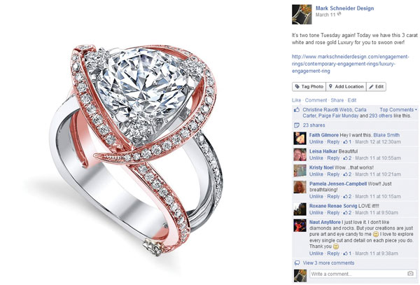
In order to implement this plan, Ginsburg first focused on Facebook. “At the beginning we thought all we had to do was post a picture of a piece of jewelry and that it would spark people’s interest,” she says. “We realized that wasn’t enough. In order to engage customers, we had to ask their opinions directly.” She started paying attention to posts that got the most likes and asked customers outright what they wanted to see. “Simply asking the question has made a really big difference in our customer outreach,” says Ginsburg. “It’s helped us get to know them and understand what they like.”
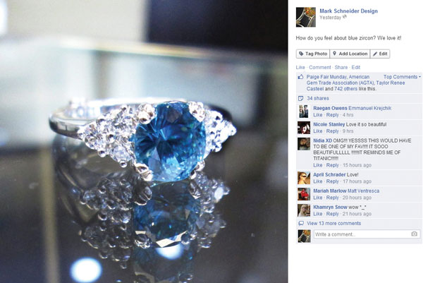
Today, the company engages customers by posting pictures of new designs, responding to followers, and personalizing posts. For example, if someone asks to see a ring in rose gold, Ginsburg posts it on Facebook and tags the person. “It makes them feel special that we are doing it for them, and it lets them know we read the comments and listen,” she explains.
Additionally, when the company has new pieces coming out of the shop, Ginsburg sometimes hosts a naming contest, offering a piece of jewelry as a prize for the winning name. She also encourages customers to share pictures of their jewelry in action. “We want to see the ring on their hand or pictures from their wedding. We want to know how the piece has made an impact on them,” she says.
“Facebook really took off when we started with the personal touches,” she continues. The site has helped the company reach the most followers of any other online medium. And this increase in followers has also directly affected sales. “We see a direct correlation between what we post and what we have inquiries about,” Ginsburg explains. “If we post a rose gold ring or a sapphire ring, people call and want more information on it.”
Along with growing its Facebook following, the company is also gaining followers on Twitter. For this social site to be effective, Ginsburg had to understand and adapt for the differences between the mediums. For example, Twitter is much more copy-based and lacks the visual appeal found in Facebook and Instagram. She also had to identify ways to effectively use hashtags to communicate. For example, while the correlating Facebook post from June offers a picture of a rose gold ring, on Twitter, the post reads “Just because we can’t get enough of #rose! #MarkSchneider.”
Once the company got a good handle on its social media presence, it joined Instagram in 2013 and has enjoyed a different kind of success than with Facebook and Twitter. Because Instagram is about creating visual posts to share with other social networks, it is sometimes more effective than reading copy-heavy Facebook and Twitter posts. Plus, it allows the company to make an even more personal connection with its customers. “A lot of times we will have customers who tag us in their wedding photos on Instagram or link to us from their wedding blogs, and it’s a very personal way to connect with them because we can follow them back,” she says.
Pinterest is another social media tool that has more recently become very successful for the company. Although the company joined Pinterest in 2011, initially it only utilized the site to showcase its own jewelry. “But we realized that there was a much wider audience to reach with a much larger range of interests,” says Ginsburg. The company now has 56 boards and more than 5,800 pins. “Since we added all the extra boards, the traffic has increased a lot,” she says. Pinterest is now one of the company’s top-performing networks and rivals its paid advertising for the amount of traffic it refers to the website.
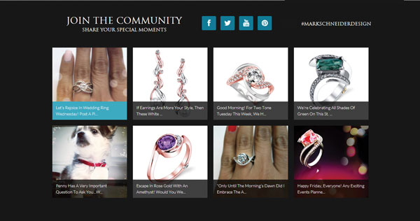
She also works to stay involved in social mediums that are currently less popular, such as Google , on which she posts content similar to her Facebook posts. And though she still keeps up-to-date blogs, Ginsburg explains that she tends to focus on social media interactions since they directly increase traffic and sales. The company has also accommodated social media’s popularity with a new website homepage, redesigned with a separate section highlighting its social media links. Because not everyone chooses to engage in social media, Mark Schneider Design is still involved in print advertising. However, Ginsburg explains, “I do think that digital advertising reaches more people because most people are online now.”
Today, Mark Schneider Design continues to see growth directly attributed to its digital marketing, and ideas are constantly flowing. “Everybody in the office is involved,” Ginsburg says. “We want to keep focusing on Mark’s jewelry and treating every customer with personalized service. I’m sure there will continue to be new social media platforms and that we will utilize them.”