

Here Comes the Sun
Finding inspiration with Tomasz Donocik
By Irina Hawkins
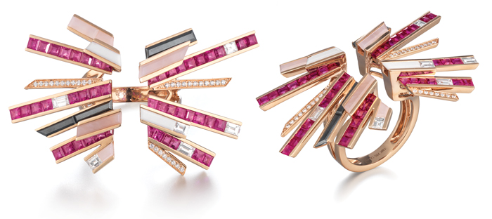
Tomasz Donocik first read Frank Herbert’s Dune as a teenager. Recently he returned to it and felt compelled to create a collection inspired by the nostalgia of the futuristic universe. The 1965 science fiction novel explores the struggle for control of planet Arrakis, which houses a coveted “mélange”—a drug that beckons with a long life, vitality, awareness, and foresight for the user. The planet’s world of intrigue unites separate tribes, families, powers, and rulers. That unity of the opposing forces, as well as their disconnectedness, can be seen in the open space at the center of Donocik’s Stellar Explosion Ring, at which the multiple segments of the piece converge.
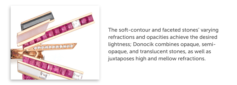
The planet’s arid dune deserts, scorching heat, and sundry rock outcroppings are reflected in the fiery palette, with sporadic inclusions of earth-toned stones. The sparkle of pavé diamonds reflects the blinding effect of the evil sun. Arrakis is a dystopian universe, and the only place to contain the sought-after drug, which brings the promise of a utopian universe, the focus for the collection. Donocik’s incorporation of soft pastels indicates goodness and the coming of daybreak. The soft-contour and faceted stones’ varying refractions and opacities achieve the desired lightness; the designer combines opaque, semi-opaque, and translucent stones, as well as juxtaposes high and mellow refractions.
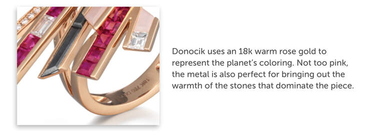
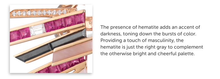
The choice of colors also betrays the superpower of Paul Atreides, the novel’s “superbeing,” who possesses the genetic memories of female and male ancestors. Donocik reveals this duality in the shades and silhouettes of the ring. The designer uses an 18k warm rose gold to represent the planet’s coloring. Not too pink, the metal is also perfect for bringing out the warmth of the stones that dominate the piece. While the Mozambique rubies, pink opal, and white agate suggest femininity, the presence of hematite adds an accent of darkness, toning down the bursts of color. Providing a touch of masculinity, the hematite is just the right gray to complement the otherwise bright and cheerful palette.
Donocik takes the novel’s theme of downfall due to decadence to heart in his design. Instead of opulence, it is the ring’s restraint that gives it power. He uses negative space to create a light and elegant design, and the ring benefits from the optical effect of advancing and receding forms. The asymmetric layers of the bold, angular shapes create depth, while the contrasting colors direct the eye. The result is a seemingly simple but modern design worthy of a contemporary empress.
